The Strategic Signals in Serif vs. Sans
In the high-stakes arena of political communication, every detail is a signal, and typography has unexpectedly entered the culture war. Secretary of State Marco Rubio’s recent directive to ban Calibri and mandate a return to Times New Roman is not merely an aesthetic preference; it is a calculated exercise in symbolic governance. By reversing a 2023 decision grounded in accessibility, the State Department is signaling a broader strategic pivot away from inclusion metrics toward a rigid definition of traditional professionalism.
This directive serves as a potent case study for campaign professionals on how administrative minutiae can be weaponized to dismantle opposing ideologies. As detailed in TechCrunch's coverage of the mandate, Rubio explicitly categorized the sans-serif option as a "wasteful" diversity, equity, and inclusion (DEI) initiative that degraded the decorum of official correspondence. The move reasserts a visual hierarchy where historical continuity outweighs modern functionalism.
The Paradox of Professionalism
The strategic friction here lies in the definition of "competence." For the previous administration, competence meant maximizing readability for the widest possible audience, including those with visual impairments. For the current leadership, competence is signaled through adherence to established norms and the visual language of authority.

This shift creates an "Accessibility Trap." While the return to serifs reclaims a sense of diplomatic gravitas, it simultaneously alienates a segment of the workforce and public. According to The New York Times's analysis of the cultural shift, this type of policy reversal acts as a "soft power" play, effectively purging institutional memory of DEI initiatives without requiring legislative action.
Key Strategic Implications:
- Micro-Signaling: Small administrative changes are now effective tools for signaling macro-ideological shifts.
- The Aesthetics of Authority: Traditional visuals are being deployed to legitimize new leadership and delegitimize predecessors.
- Operational Friction: The pivot forces a trade-off between symbolic weight and operational accessibility.
For strategists, the lesson is clear: in the current political ecosystem, even the default settings on a word processor are potential battlegrounds for defining organizational values.
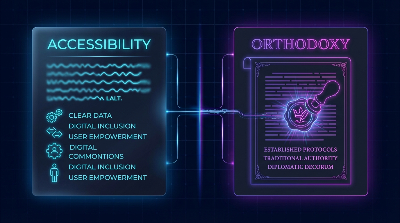
The Font War Origins: From Accessibility to Orthodoxy
To understand the strategic magnitude of this reversal, we must analyze the operational history of the State Department’s typography. This is not merely a preference for serifs over sans-serifs; it is a tug-of-war between two distinct governance philosophies: universal accessibility versus established tradition.
The 2023 Modernization Mandate
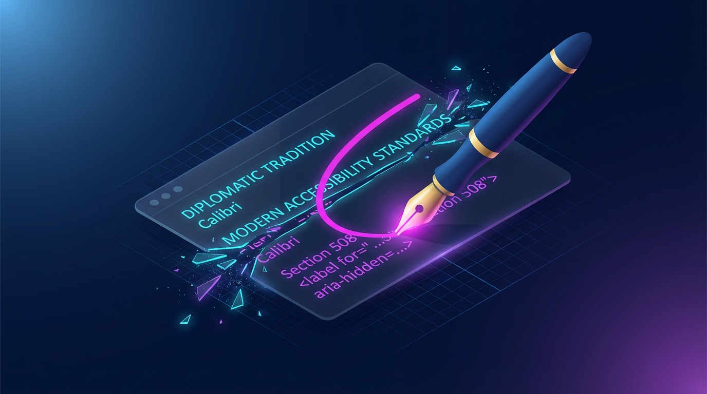
The conflict began in January 2023, when the State Department, under Secretary Antony Blinken, initiated a sweeping overhaul of its visual standards. The directive was clear: retire the venerable Times New Roman in favor of Calibri. This was not an aesthetic choice, but a functional one driven by data regarding neurodiversity and visual impairment.
According to The Verge's report on the initial transition, the shift was explicitly recommended by the Office of Diversity and Inclusion to align with Section 508 of the Rehabilitation Act. The logic was grounded in operational inclusivity: sans-serif fonts like Calibri are significantly more legible for individuals with dyslexia and low vision, reducing the friction of internal communication.
The Strategic Intent of 2023:
- Reduce Cognitive Load: Streamline reading for staff with visual processing challenges.
- Modernize Optics: Align diplomatic correspondence with contemporary business standards.
- Signal Values: Visually demonstrate a commitment to DEI (Diversity, Equity, and Inclusion) principles.
The 2025 "Return to Decorum"
Fast forward to December 2025. Senator Marco Rubio, incoming Secretary of State, identified this typographical shift not as an accessibility win, but as a symptom of institutional drift. In a directive that AP News describes as a rejection of "woke" initiatives, Rubio ordered an immediate reversion to Times New Roman.
Rubio’s argument reframes the utility of Calibri as "wasteful," positioning the serif font Times New Roman as the guardian of diplomatic gravity. By reverting to the older standard, the leadership is signaling that formalism and tradition now outrank accessibility metrics in the hierarchy of departmental values.
Comparative Analysis: The Two Regimes
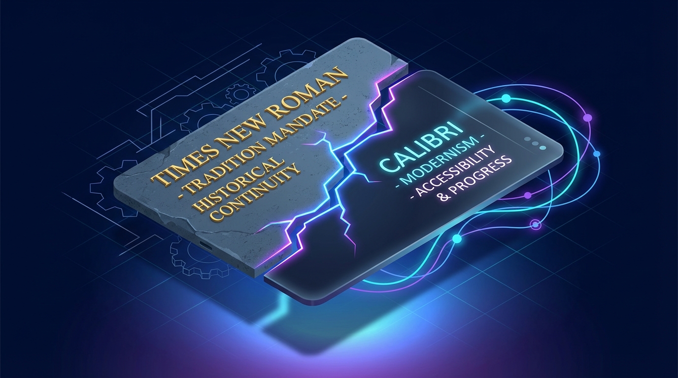
| Feature | The Calibri Era (2023-2025) | The Times New Roman Era (2025+) |
|---|---|---|
| Primary Driver | Accessibility & Inclusivity | Tradition & Formalism |
| Visual Signal | Modern, approachable, fluid | Authoritative, rigid, historical |
| Strategic Goal | Reducing internal friction | Restoring external prestige |
| Perceived Weakness | Lacked "gravitas" of statecraft | Creates barriers for visually impaired |
The Accessibility Paradox
The critical tension here lies in the trade-off. While the return to Times New Roman restores the "look" of traditional diplomacy, it creates a quantifiable efficiency trap. By removing a font optimized for screen reading and dyslexic processing, the department effectively re-introduces friction into its communication layer. The leadership has made a calculated decision that the aesthetic of authority is worth the cost of operational exclusion.
Unpacking the Mandate: The Semiotics of Statecraft
The reversion to Times New Roman is not merely a preference for serifs; it is a calculated exercise in brand sovereignty. By targeting a typeface, Secretary Rubio is signaling a complete repudiation of the "technocratic inclusivity" that defined the previous administration's internal culture. In this context, typography is no longer a design choice—it is a proxy for the ideological battle between modern accessibility and traditional authority.
The "Wasteful" Narrative
Rubio’s framing of the Calibri adoption is strategically precise. He did not attack the font based on legibility, but rather categorized it as a "wasteful" initiative. This language transforms a zero-cost digital setting into a symbol of bureaucratic bloat. As reported by The Guardian, the move is framed as a restoration of professionalism, explicitly linking the sans-serif aesthetic to a degradation of diplomatic standards.
This creates a powerful narrative device:
- The Enemy: "Woke" bureaucracy that prioritizes inclusivity over tradition.
- The Solution: A return to the visual language of the 20th century.
- The Signal: The State Department is returning to a "Serious Power" footing.
The Rejection of "Silicon Valley" Values
The original shift to Calibri was driven by data regarding readability on screens and accessibility for neurodivergent readers. GovTech’s analysis of the original switch highlights that the move was rooted in modernization and digital-first communication strategies. By reversing this, the State Department is explicitly rejecting the User Experience (UX) model of governance.
In the UX model, the primary goal is friction reduction for the user (the reader). In the Imperial Model favored by the new leadership, the primary goal is the projection of gravity and historical continuity. The serif font, with its "feet" and variable stroke widths, visually anchors documents in the past—a deliberate choice to associate current policy with historical American power projection.
The Cosmetic Trap
However, this strategy carries a hidden risk: the Cosmetic Trap. By focusing executive capital on the formatting of memos, leadership risks signaling that they prioritize the appearance of governance over the mechanics of it. The Washington Post notes that banishing the sans-serif font is a highly visible, low-effort move that generates immediate cultural friction without solving substantive diplomatic challenges.
Strategic Implications of the Font Wars:
| Component | Calibri (The Discarded) | Times New Roman (The Restored) |
|---|---|---|
| Primary Value | Accessibility / Efficiency | Authority / Tradition |
| Visual Code | Tech / Corporate / Modern | Legal / Academic / Historical |
| User Focus | The Reader (Inclusivity) | The Institution (Prestige) |
| Political Signal | "We are evolving." | "We are returning." |
Operational Friction as a Feature
Ideally, internal communications are friction-free zones. However, this mandate introduces intentional friction. It forces staff to actively unlearn recent protocols and adopt a standard that is objectively harder to read on the digital devices where most diplomacy now occurs.
This is a Loyalty Test disguised as formatting. Compliance with the font change signals alignment with the new regime's cultural values. It forces the entire apparatus of the State Department to perform a daily, repetitive act of submission to the new ideology with every memo typed. The inefficiency is not a bug; it is the point. It serves as a constant reminder of who holds the pen.
Unpacking the Font Wars: The Accessibility Paradox
While the headlines focus on the "anti-woke" political signaling, the strategic implications of this mandate run deeper into the mechanics of information consumption. The shift from Calibri back to Times New Roman represents a fundamental clash between digital utility and analog authority.
At a structural level, this decision prioritizes the optics of the message over the efficiency of its reception.
The Cognitive Overhead of "Serif Sovereignty"
The original transition to Calibri was not merely an aesthetic choice; it was a functional update designed to reduce cognitive load. Modern sans-serif typefaces like Calibri are optimized for screen reading, where the majority of diplomatic cables are now consumed.
By reverting to Times New Roman, the State Department is re-introducing visual friction into the communication stack.
According to federal accessibility guidelines, sans-serif fonts are preferred for digital interfaces because they scale better across devices and are significantly more legible for individuals with visual processing differences. As noted in Section508.gov's guidelines on accessible typography, clear, robust typefaces are critical for ensuring information is accessible to users with low vision or cognitive disabilities.
The Strategic Trade-off:
- Calibri (The Discarded Asset): Prioritizes the receiver's ease of reading and inclusivity.
- Times New Roman (The Mandated Standard): Prioritizes the sender's projection of historical weight and formality.

The Economics of Ink vs. Pixels
Senator Rubio categorized the previous font switch as "wasteful," yet the economic reality of typography is counter-intuitive. In a paper-based economy, typeface choice has measurable fiscal impact. Thinner, serif fonts like Times New Roman generally use less ink and occupy less horizontal space than modern sans-serifs.
Historical analysis suggests that government agencies can realize significant savings simply by optimizing typeface for print volume. A widely cited analysis highlighted by Business Insider suggests the government could save millions annually on ink costs by switching to more efficient fonts (in that specific case, Garamond).
However, in a 2025 context, this is a Legacy Value Proposition.
- The Reality: Most State Department communication is digital-first.
- The Paradox: Optimizing for "ink economy" in a digital ecosystem is a strategic misalignment. The "waste" Rubio cites is likely framed around the administrative hours spent on the initial switch, rather than material costs.
The Reversal of "Universal Design"
The initial move to Calibri was part of a broader "Universal Design" strategy intended to modernize the diplomatic corps. The logic was that accessibility should be the default setting, not an accommodation.
By dismantling this, the new directive treats accessibility as a specialized "add-on" rather than a core component of infrastructure. GovTech's analysis of the original switch highlighted that the move was specifically engineered to assist staff with dyslexia and visual impairments, aligning the department with modern corporate standards.
The reversion sends a clear message: Tradition outranks Inclusion.
The table below outlines the functional divergence between the two standards:
| Feature | Calibri (The "DEI" Standard) | Times New Roman (The "Rubio" Standard) |
|---|---|---|
| Primary Medium | Digital Screens / Mobile | Printed Letterhead / Memos |
| Visual Signal | Modernity, Approachability | Authority, Tradition, Formality |
| Accessibility | High (Dyslexia-friendly) | Moderate (Serifs can cause visual noise) |
| Strategic Goal | Frictionless Information Flow | Preservation of Institutional Decorum |
This creates a scenario where the "professionalism" of a document is inversely correlated with its actual readability for a segment of the workforce. The campaign for "decorum" effectively imposes a legibility tax on the department's internal communications.
The Compliance Ripple Effect: Beyond Typography
The reversion to Times New Roman signifies a profound shift in how government operations are evaluated. We are moving from a metric of functional inclusivity to one of symbolic traditionalism. This decision establishes a precedent where operational tools are vetted not for their utility or efficiency, but for their perceived political alignment.

The Cost of Symbolic Governance
While the stated intent is to eliminate "wasteful" initiatives, the act of reversing an established technical standard introduces its own layer of operational friction. Large organizations rely on default settings to streamline workflow; forcibly reverting these defaults requires significant administrative overhead.
According to Reuters's report on the font coup, this move is less about aesthetics and more about asserting control over the cultural output of the department. However, this assertion of control comes with a hidden price tag:
- Retraining Overhead: Staff accustomed to modern sans-serif defaults must now actively reformat correspondence.
- Template Refactoring: Thousands of internal documents, memos, and digital assets must be retrofitted to comply with the new "decorum."
- Legacy Tech Debt: Re-centering print-centric fonts (Times New Roman) in a digital-first world ignores screen readability optimization.
The paradox here is sharp: In an effort to curb "waste," the department is engaging in a massive, non-functional administrative churn.
The "Woke" Audit Expanding
The most critical strategic implication for campaign professionals and government contractors is the widening definition of what constitutes a "DEI target." If a font designed for dyslexia readability is classified as a political statement, the scope of the "anti-woke" audit is effectively limitless.
The Guardian's analysis of the administration's stance suggests this is merely the opening salvo in a broader dismantling of inclusive infrastructure. We can predict that this scrutiny will rapidly expand to other operational areas:
| Operational Target | Potential "Political" Interpretation | Strategic Implication |
|---|---|---|
| Plain Language Guidelines | "Dumbing down" official discourse | Return to legalese and exclusionary jargon |
| Remote Collaboration Tools | Facilitating "disconnect" from DC culture | Forced return-to-office mandates |
| Automated Alt-Text AI | Prioritizing "niche" accessibility over speed | De-prioritization of Section 508 compliance |
Strategic Forecast
For vendors and strategists, the message is clear: Neutrality is no longer assumed. Features previously marketed as "user-friendly" or "accessible" may now be viewed as political liabilities depending on the administration in power. The "Legibility Tax" is just the beginning; the next phase is a Compliance Tax on any tool that prioritizes inclusivity over tradition.
Navigating the Aesthetics of Authority
For campaign strategists and government contractors, the "Great Font War" of 2025 serves as a critical bellwether: Operational aesthetics are no longer neutral. The visual language of your organization is now a signal of political alignment. To navigate this shifting landscape without incurring reputational damage or operational friction, leaders must adopt a proactive "Design Diplomacy" strategy.
Action Plan for Strategic Adaptation
1. Audit Your Defaults Do not assume software defaults are safe. The "Calibri Trap" occurred because it was the default setting in Microsoft Office, making it an easy target for criticism regarding passivity or "bureaucratic drift." Review your organization's standard templates. Intentionality is your shield; if you use a modern font, be prepared to defend it with efficiency data, not just "it was the default."
2. Bifurcate Your Communication Channels Successful campaigns will increasingly need to speak two visual languages.
- The Channel of Authority: Use serif fonts (Times New Roman, Garamond) for official policy documents, legal filings, and communications targeting traditional institutions. This signals respect for heritage and established order.
- The Channel of Agility: Retain sans-serif options for digital-first content, social media, and internal rapid-response memos where speed and screen readability are paramount.
3. Monitor Vendor "Political Debt" Tech vendors must ensure their tools allow for rapid customization. Hard-coded design choices are now liabilities. As highlighted in The Verge's analysis of the cultural backlash, when a simple typeface is branded "too woke" for government work, vendors who cannot offer immediate, granular control over visual output risk losing government contracts to more flexible competitors.
The Accessibility Paradox
The most significant risk in this pivot is the potential exclusion of talent. While returning to serif fonts may signal conservative professionalism, it creates a quantifiable friction point for staff with dyslexia or visual impairments. Leaders must quietly maintain "accessibility overrides"—tools that allow individual employees to convert documents to readable formats locally without altering the official outbound aesthetic. The organizations that master this invisible accommodation will retain top talent while publicly adhering to the new visual mandate.
TL;DR — Key Insights
- Marco Rubio banned Calibri at the State Department, labeling it a "wasteful" DEI initiative to revert to Times New Roman.
- This move signals a strategic pivot from accessibility-driven communication to traditional professionalism and authority.
- The font change creates operational friction by prioritizing perceived gravitas over digital readability and inclusivity.
- This administrative shift weaponizes minor details to dismantle opposing ideologies and signals a rejection of modern UX principles.
Frequently Asked Questions
Why did Marco Rubio ban Calibri at the State Department?
Secretary of State Marco Rubio banned Calibri, labeling it a "wasteful" Diversity, Equity, and Inclusion (DEI) initiative. He mandated a return to Times New Roman to signal a shift towards traditional professionalism and authority over modern accessibility standards.
What was the original reasoning for using Calibri at the State Department?
The previous administration adopted Calibri in 2023 for its improved readability, especially for individuals with dyslexia and visual impairments. This decision was aligned with accessibility guidelines to reduce cognitive load and promote inclusivity in official communications.
What are the strategic implications of this font change?
This move signifies a broader ideological pivot, using administrative minutiae to signal a rejection of DEI principles. It prioritizes the aesthetics of authority and historical continuity over functional inclusivity, creating operational friction for users.
How does this font change impact accessibility?
Reverting to Times New Roman, a serif font, can create barriers for individuals with dyslexia or low vision, as sans-serif fonts like Calibri are generally considered more legible on digital screens and for those with visual processing differences.